Building Accessible Flexible Forms
Senior Accessibility Designer, 2U Inc
What & Why
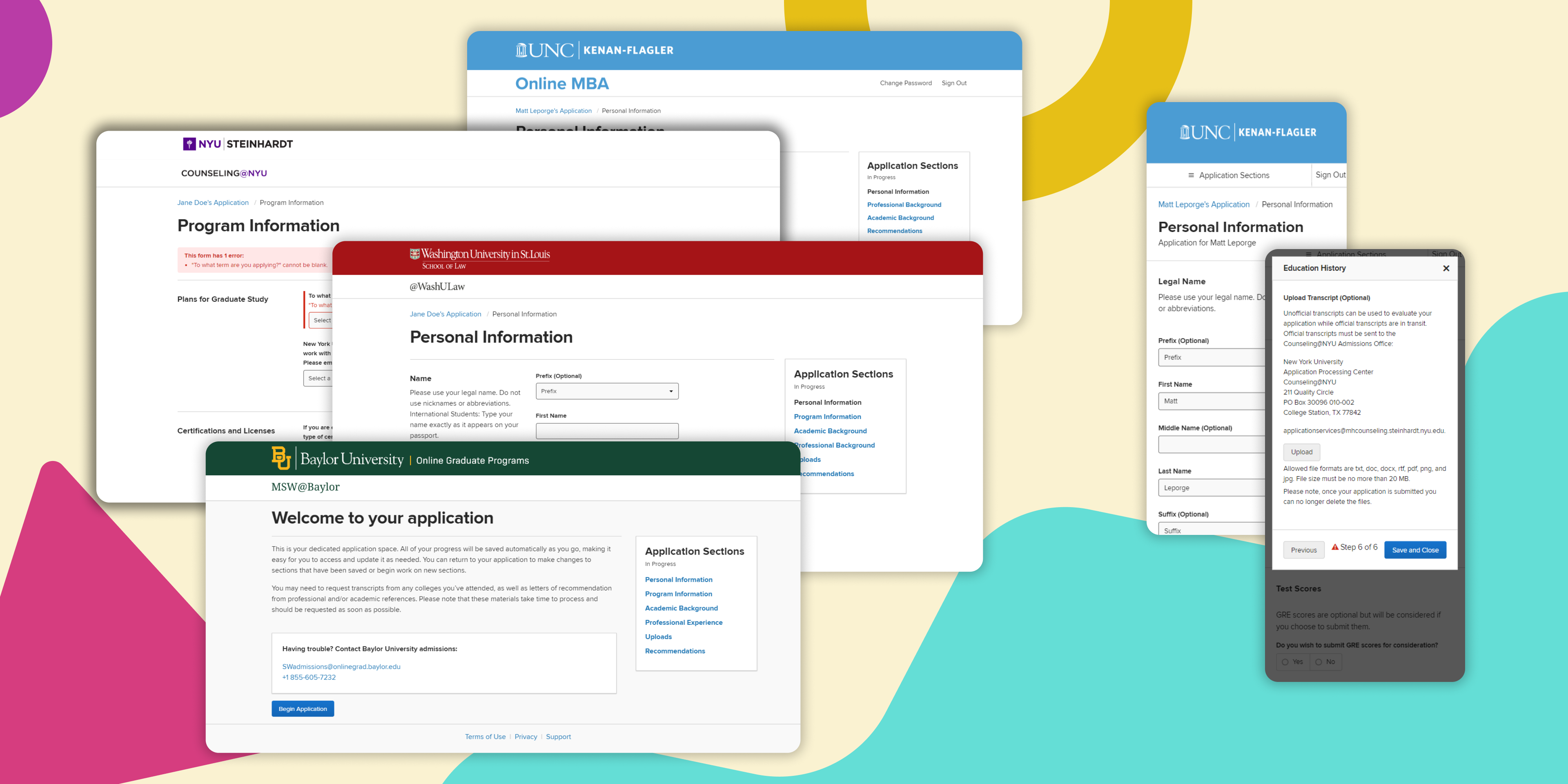
The first interactive touch point students have with 2U’s products is our online application, populated with specific questions set by our university partners.
Prior to this project, these forms were built manually, requiring weeks developer work for both initial standup and maintenance. We set out to replace this manual workflow with a CMS for managing both forms and student information, with a new modular form UI to go with it.
Project Goals
- Rethink our applicant experience, providing a more professional visual style while adhering to partner specific brand guidelines
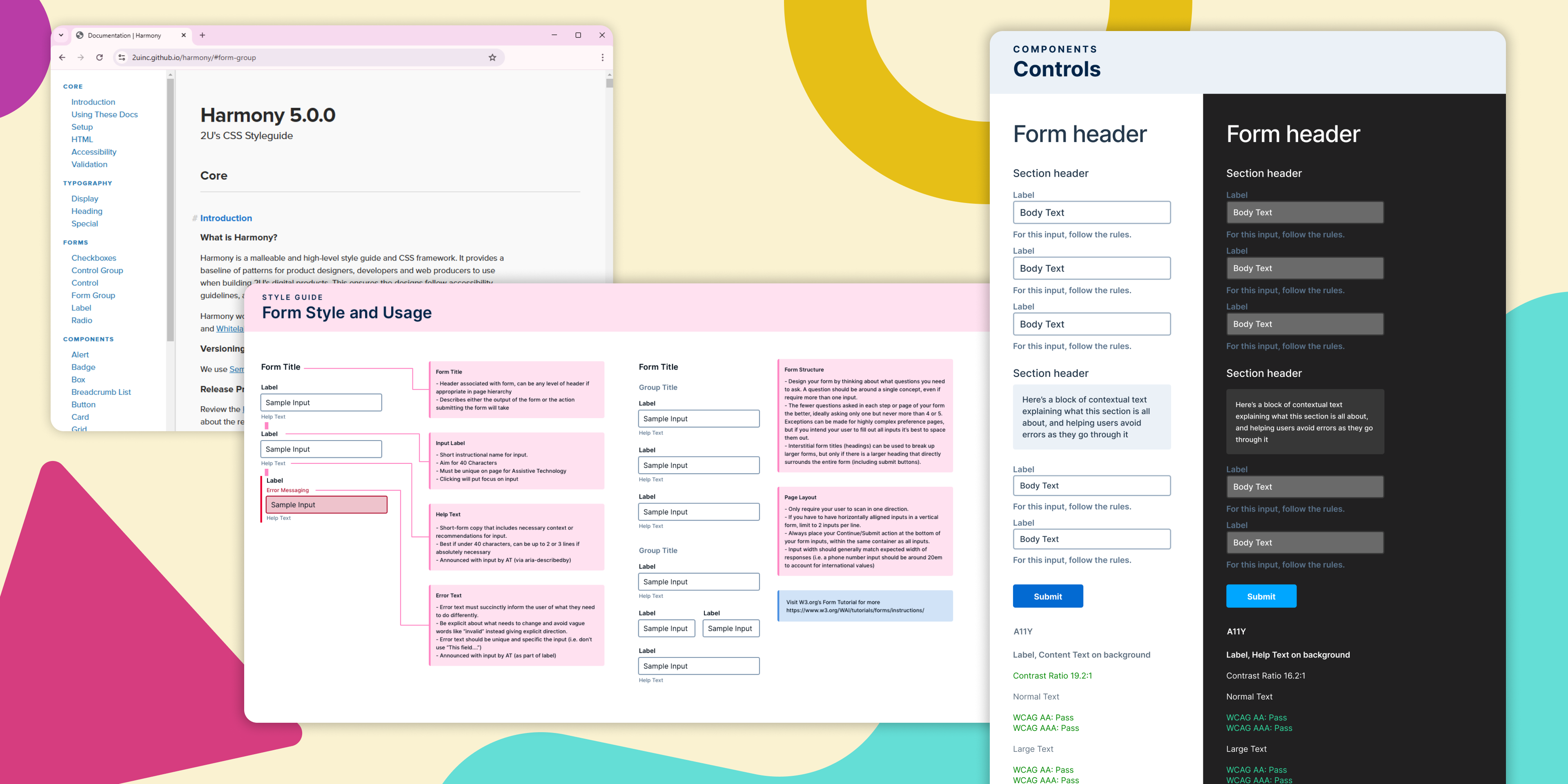
- Build a form library for our design system, prioritizing clarity and WCAG compliance
- Replace a manual developer-heavy standup process with a scalable CMS to be used by university partners directly
- Build tools for university admissions teams to manage sensitive applicant information
Known Risks
- Success required convincing internal stakeholders that the benefits of a new CMS were worth abandoning established manual workflows
- University contracts required flexibility in both content and branding, or else partners might continue to use our older system.
- Most 2U products (marketing sites, learning platform, etc) were using their own implementations of branding guides, so any unified library vision required meeting with engineering leads to ensure new components fit the specifications needed by their products.
My Role
This project began with concrete goals but a lack of clarity around the path and specific features needed. My first action was to spend a week shadowing members of our admissions team, building an understanding of what current pain points existed in their workflows and what our tools needed to deliver for them.
Next, I ran a series of brainstorming workshops with product and engineering leaders, reaching common ground on our target feature set with benchmarks for user testing along the way. Once priorities were aligned, I remained embedded within the development team for the duration of development as lead designer.
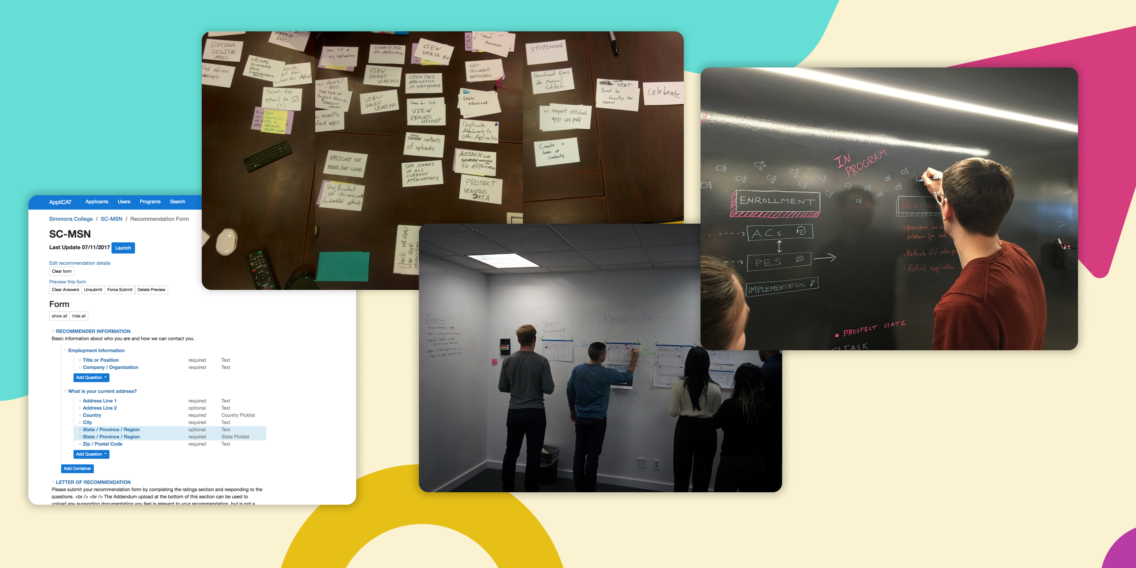
While engineers were coding the bones of a new backend, I built interactive code prototypes of our form builder and application manager to test layouts and functionality with our partner relations teams. This portion of the final product was built using stock Bootstrap for visuals, as the user base made it very clear (repeatedly, loudly) that they needed something highly functional and didn’t care about appearance beyond clarity.
Though the CMS interface valued function and feature density, the interfaces that students would see were held to a high visual standard by both users and our brand partners. I designed a forms language that fit our design system, prioritizing a rigid hierarchy to ensure questions and associated information could be parsed by assistive technology. I prototyped and tested this system with accessibility consultants and AT users to fix any technology-specific snags.
For legal reasons we were not able to do proper user research with potential students at this stage, but all UI designers were hallway tested internally and went through multiple stages of team design critiques.
Rollout, Metrics, and Next Steps
Our new tool was rolled out in 3 discrete stages, first on smaller forms used for letters of recommendations, then on a sample set of university partners with a multi-year roadmap to extend to all others. The CMS had immediate returns in efficiency, dramatically reducing the time needed to complete simple form content updates and creation, while completely removing a number of tasks that used to require developer intervention.
Measuring concrete user impact is trickier - we launched this new form in parallel to numerous new degrees meaning we had little to no baseline to compare against, but repeated rounds of user testing after launch found users consistently preferring the new visuals, finding the form layout easier to parse and crucial information and deadlines more discoverable.